
Time Management
Week Four

Week 4 for our project we created 'Trello' plans. These will document our tasks for the rest of the project on what we are finished with, doing at the moment and what we plan to do in the future. To start of with I showed that I want to do the basics of coding , music and game art yet I want to finish other work before moving on to them. I also show the work I am working on at the moment, ( Research, Planning, Reflective journal and Project proposal). Lastly, it presents clearly that I have completed the Idea generation tasks so I can improve an work on other ares before revisiting that.
Week Five

Week 5 I started to work on more writting/ sprite aspect of my FMP. This includes remaking all the NPC sprites, making the plauge doctor and starting to make the other sprites for coding -eg crying and stomping. However, since this is a two week holiday I can't code at home without help and the project so my goal for week five and six is to get as many sprite work done as I can.
Week Six / 7

On week 6 and 7 I mainly worked on sprite work due to the Half term break. I completed my Background art and i'm half way with completing the necessary sprite work. By doing this I can come closer to achieve my goal of making a functional game that gets a high grade. This will impact my FMP positively since it shows my dedication for adding around 10 new high quality sprite works in a short amount of time.
Week Eight

On week eight I mainly did coding work focusing on adding the basics like biting , timer and being able to change rooms.This will help me start to add more features to my game such as the unique NPC options. This impacts my FMP positively since I have shown improvement in coding as I am half way their with adding my wain features as this week my ability to work at home was cut short to to internet issues and moving.
Week Nine

On week nine I lost all my reflective journals due to a glitch in Wix , So I spent most of the week fixing and redoing them . I also in my spare time added new code and sprites to reach my dead lines at the end of this FMP. By doing this I can achieve a higher grade on this portion. I added things such as new run cycles when bitten and fixed bugs like the red flash encounters.
Week Ten

On week ten I worked on more coded heavy work and added a lot of new mechanics. I was working in the, basic mechanics plus the mini-games elements. By doing this I can progress my work by adding more coded heavy functions to my FMP making my game closer to playable , which will improve my FMP grade majorly.
Week Eleven

On week 11 I mainly worked on game sprites, production / reflective logs and some coding / music. I finished all necessary sprites I need and started on new things such as music to elevate my game. By doing this I am very close to finishing this FMP and getting a high grade. This will over all improve my FMP by adding more intrigueing content to my game.
Week Eleven/ end


Mood Board's
Clothing Ideas


This mood board presents photos of Victorian fashion for men and women. I found these images on Google and Pintrest and complied them together using Power Point. This is helpful because it gives me a visual representation on Victorian fashion for men and women improving my realism aspects and making my sketches /clothes ideas more realistic and confident. This is beneficial for planning due to it helping me find and improve on my character designs by showing me multiple ways people dressed back then ( colours, styles and fabrics). I will incorporate this into my FMP by making characters based of my research on Victorian dressing.
Background Ideas
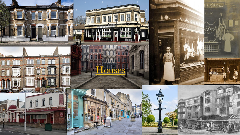

This mood board presents photos of Victorian housing for streets and individual homes. I found these images on Google and Pintrest and complied them together using Power Point. This is helpful because it gives me a visual representation on Victorian housing and atmosphere improving my realism aspects and making my sketches /background ideas more realistic and refined. This is important for planning due to it helping me find and improve on my background and object designs by showing me multiple ways homes and places were constructed and how to make a background not feel out of place in its surroundings. I will incorporate this into my FMP by making my backgrounds and objects similar to their real life counter parts from this mood board to make realistic backgrounds for the time period.
Illness Symptoms


This mood board presents photos of the symptoms of the Black Plague. I found these images on Google and Pintrest and complied them together using Power Point. This is helpful because it gives me a visual representation on the real life effects it had on the human body and making my sketches /sprite ideas more realistic and detailed. This is important for planning due to it helping me find and create animations and sprites based on these symptoms to create more dark yet realistic game play ( adding vomiting , red eyes, rashes). I will incorporate this into my FMP by making my sprites incorporate aspects of theses symptoms when infected to make the player easily detect if the are ill or not.
Pixel Art References
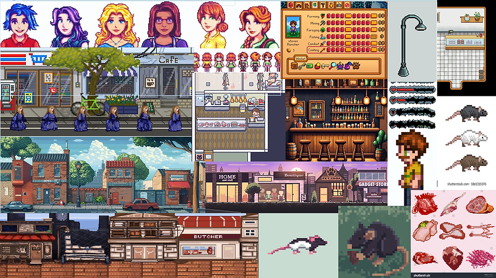

This mood board presents pixel art sprites of people and objects. I found these images on Google and Pintrest and complied them together using Power Point. This is helpful because it gives me a visual representation on concepts and references for creating my own pixel art sprites with a unique flare giving me more chances to make compelling work. This is important for planning due to it helping me create sprites with aesthetic visuals and animations that work with the simple pixel style. I will incorporate this into my FMP by making my sprites incorporate aspects help from these references to make my pixel art stand out and look compelling for a player.
Animal References


This mood board presents real pictures of breeds of rats/mice. I found these images on Google and Pintrest and complied them together using Power Point. This is helpful because it gives me a visual representation on different breeds and patterns rats could have and make my designs and sketches of them more unique and vast creating more realistic and improved sketches. This is important for planning due to it helping me search about breeds of rats so my own play-able rat can look more distinct and incorporate the research i have done. I will incorporate this into my FMP by making my sprites incorporate aspects help from these references to make my pixel art stand out and look compelling for a player.
People References


This mood board presents real pictures of Victorian people ( pictures and photographs). I found these images on Google and Pintrest and complied them together using Power Point. This is helpful because it gives me a visual representation on different faces and aesthetics with people making m,y design composition more distinct person to person accomplishing my goal of creating vast NPC's and making my sketches stand out with the unique face types . This is important for planning due to it helping me learn how to make different faces to avoid same face syndrome in mt designs and making people spot things like age and body types more easier even in pixel art. I will incorporate this into my FMP by making my sprites incorporate aspects help from these references to make my character look very different to each-over, which makes my NPC's more compelling.
Safety And Risk Assessment
Physical Hazards
Digital Hazards
Physical hazards in a workspace refer to the potential risks that can cause physical harm or injury to workers due to physical tasks, outside factors or unstable conditions present in the workplace or even a team of people.
Digital hazards in a workspace refer to the potential risks that can cause harm to projects or extra unnecessary work to workers due to mistakes , outside factors or unstable and broken conditions present in the equipment.
Examples for physical hazards and there impacts include :
1. Fires. Not only can expensive equipment and data from projects be lost but human lives can be lost harming the studios name and maybe even canceling the project.
2. Health issues. This incorporates eye strain ,posture and general fatigue ; impacting workers performances in creating assets due to feelings of burn out.
3. Electrical issues. Making sure you understand and know your surroundings and making sure you don't touch exposed wires or deal with faulty equipment.
4. Trips and Slips. Creating a danger free work environment by cleaning up spills or cautioning others to areas that might be wet or unsafe.
5.Workplace harassment. Keeping your team and workers safe, having a safe environment that others that might need help can go to.Having repercussions for people how harass over gender,race, disabilities or religon.
The Lizard Squad
The Lizard Squad are a notorious hacking group of around seven people who on December 25, 2014 -Christmas Day-, Lizard Squad claimed to have performed a DDoS attack on the PlayStation Network and Xbox Live. This caused many consoles on Christmas to not work as intended. While that is there most known case they have done many horrible things such as, bomb threats, Xbox PlayStation and League of Legends servers being shut down, The Tor Sybil attack and on January 26, 2015, the website of Malaysia Airlines was hacked, allegedly by Lizard Squad, users were redirected to another page showing an image of a tuxedo-wearing lizard, and reading "Hacked by Cyber Caliphate" This also affected the company's image since many people feared that their information was in the hands of these dangerous hackers causing backlash and adults not buying consoles in fear of the Christmas incident happening again and this would cause mass hysteria and conspiracy theory's that this was a planed attack to steal peoples data. Conclusion, this was a dangerous hacking group that harmed the biggest game industry's.
How could this of been prevented and did it stop attacks like these happening again? The main reason this happened was due to weaker password and fire wall protection. Now in 2025 it's rare for hacking's of this caliber to happen to big gaming company's.And the fact more people are aware that this can happen help the public not be as scared as they were back in 2014
Examples for digital hazards and there impacts include :
1. Data loss. the entire game or assets being completely deleted causing issues causing delays crunch times or maybe even canceling the project.
2. Hacking. Making sure your passwords are secure and unable to be used by outside people. This is a big problem for AAA games due to people leaking endings, twists or even a while game ruining its launch.
3. Copyright. Another issue is copyright, making sure you don't use any other IP or assets in a game. Not double checking this could cause legal trouble.
4. Scope creep. The act of continuously adding extra stuff to a game. Making sure you don't add extra stuff before launch help to prevent new bugs and less stress on your end.
5. Deadlines. Timing your work properly so you don't burn yourself out or under-preform. Taking breaks helps combat this as long as you have a smart schedule of when to work.
WII Remotes

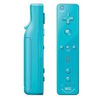
Around 2006 Nintendo released it's new product the Nintendo Wii. A sleek normally white box with a sleep and power off button and a disk drive but the main aspect of this console was the Wii remote. One of the first wireless remotes used by moving the remote to play . Eg: slicing motions to cut food, throwing motions for sports or just simply pointing it at the screen to move the cursor. While this was a big hit even having new items to slot the rem steering wheel and numb-chucks) the main issues for being a hand held console can into play. The wrist strap of the Wii Remote has also been an issue. In mid-December 2006, the law firm Green Welling filed a class action lawsuit against Nintendo for its "defective wrist straps". A few days later, Nintendo issued a product recall for the wrist straps and issued a new version of the strap with an improved securing mechanism for the wrist, leading to the lawsuit to be dropped. The main issue with the Wii was the fact people accidentally throwing there remotes into TV's causing more destruction since most games had the player jumping or making fast movements- Just dance Wii party. This caused many to dislike the Wii due to more damage being done by simply the strap not being secured properly causing the Wii U not to do very well. any also didn't like that you had to buy certain remotes for games, the main one being a motion plus remote to play the Will sport Resort ; to combat this Nintendo made a flimsy cheaper rubber mesh to put around the remote to be able to play the game without buying a new one yet it would constantly disconnect.

How did this change contactless games in the future? Nowadays, things like Vr and games using Wii like remotes have more warnings to be careful of surroundings. And the most important thing is that people are aware of what could happen and our more careful. Normally you have to hold the remote to use it like a VR remote instead of a strap having more control over it.


A risk assessment is a health and safety document to make sure the equipment and people in a workspace are safe.The reason this is helpful to learn now is so we are prepared for things like hacking and copyright issues and not panic. This is also helpful for team managing by knowing the basics on keeping people safe.

Clothing ideas
Blue Women

This design idea is for the Damsel. The main core aspects with this character is depicting her dainty feminine nature with the incorporation of soft blues. This presents her as soft yet ignorant since while her dress are poofy and big the colour blue back then were seen as royal and rich meaning she comes form a privilege background , which could interoperate shes quite ditsy when it comes you more middle class places


1
2
3
4
1. Dress idea one: This first dress is a navy blue opened collar dress.It's main features is it's open blouse showing a high white collar and how its tied up into a little bow at the sides. I like the colour scheme this dress has and the little details of an open blouse/tied up dress give the nature of her feminine personalty shine through. However, making this work for a 2d flat character could be hard getting all the detail.
2. Dress idea two: This next dress has a more cyan colour scheme with more formal elements. It's main features are it's golden belt and suit like appearance. I like it's use of accents like gold to make the design pop out more and it's suit nature makes her look more royal and higher class. On the other hand, this type of appearance doesn't give of her more dainty vibes and the cyan is a bit to out of place in it's surroundings.
3. Dress idea three: This dress is a very light blue and has the vibes of something a princess could wear.It's main features are its many ruffles and it's high up belt.I really like the ruffle aspect of the dress since it will make the character very recognizable and gives of her appearance of a high class women that enjoys her femininity. On the contrary, I dislike the coulor scheme as it's not unrealistic for the time but unappealing to the eye in my opinion and while I said I enjoyed the poofy dress aspect I feel like it over does the character and makes her look more like a princess than just a rich women.
4. Dress idea four: This last dress design is the darkest shade of blue with a red bow accent.It's main features are it's red bow, and its high corset creating a poofy dress motif. I like its feminine aesthetic with is fluffy long trail and poofy sides, I also like it's open blouse as a pop of white. I however, dislike it's red bow as I find now its very distracting and over complicates the character, I also think this blue is to dark with her light complexion.
I have chosen the first dress idea for the 'blue women'because I really adore the coulor scheme I have chosen for this characters dress. I like the small details like an open blouse and a small tied up rose motif in her dress. Incorporating this into my FMP I will re make my sprite to incorporate these new details to improve her design.
Red Women

This design idea is for the Aggressor. The main core aspects with this character is depicting her harsh closed off nature with the incorporation of bold reds. This presents her as powerful yet danger since her design traits incorporate and older fashion sense of high status with a more formal attire, the sharp red indicate to the player that unlike the damsel this character might be a threat.


1
2
3
4
1. Dress idea one: This first dress is a de-saturated red with golden accents/buttoned up collar dress.It's main features is it's rows of buttons with gold trims running down the middle and it's floral pattern at the bottom of the dress. I like the colour scheme this dress has and the little details of a floral pattern trailing up the dress making it more unique. However, making this work for a 2d flat character could be hard getting all the detail, mainly since it side on.
2. Dress idea two: This next dress has a more elements of detail with a deep rose red colour scheme. It's main features are it's lace accents and long trail. I like it's use of lace like giving it more personality and a nice contrasts to the deep reds. However, this type of appearance feels to feminine and youthful for her character and the reds are too dark in my opinion to stand out from he rest.
3. Dress idea three: This dress is a lighter red and has the vibes of something a simple yet elegant. It's main features are its many ruffles and a soft fabric style.I really like the ruffle aspect if the dress since it will make the character very recognizable and gives of her appearance of a high class women that. On the flip side, I dislike the coulor scheme as while it is realistic for the time the colour look to washed and dim for an interesting design, and while this NPC dislikes bring attention to her self I feel like this dress is to dull and simple for this women.
4. Dress idea four: This final dress design is the boldest shade of red with black accents through out.It's main features are it's black bow,black open collar and its high collared white shirt underneath. I like its bright and bold aesthetic with is contrasting darker accents to make a unique dress. I also like it's open blouse as a pop of white. I contrarily, dislike it's poofy nature as it resemble aspect of the damsels dress when their meant to be polar opposites. And while the red this powerful I worry it will be to out of place in a de-saturated place causing her to stand out negatively.
I have chosen the first dress idea for the 'red women'because I really like the dimer coulor scheme I have chosen for this characters dress. I like the small details like the subtle floral pattern trailing up the skirt part and the vast amount of golden buttons showing her high class.To incorporate this into my FMP I will re make my sprite to incorporate these new details to improve her design.
Green Man

This design idea is for the Charmer. The main core aspects with this character is depicting his youthful and charming nature. This presents him as a kind soul that might be a bit to much of a hopeless romantic, the dim grays make his other features -his green eyes- pop out more and draw your attention. ( I have decided to switch the palettes of the green man and gray mans clothes for a more unique piece).


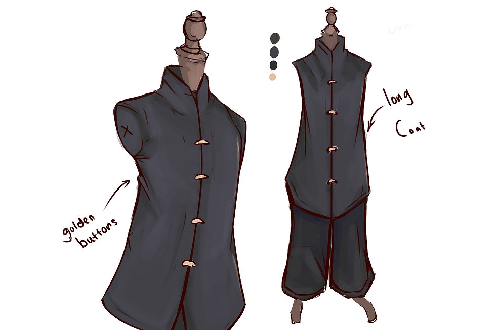

1. Clothes idea one: This first suit is a buttoned up brown suit with a black bow and plaid pants.It's main features is formal appearance with it's silver buttons and high collared white under shirt. I like the colour scheme this suit has and the little details of a plaid pattern giving more detail and uniqueness to his character. Contrarily, making this work for a 2d flat character could be hard getting all the detail, mainly since it side on it's also feels too formal and dull for his character.
2. Clothes idea two: This next coat has a more elements of detail with it's long brown coat. It's main features are it's long brown coat, with a pop of white with his undershirt. I like it's use of his open coat giving a more lose impression with it's bright contrasting colour to improve his design. However, this type of appearance feels to basic and bland for his character I also dislike the use of colour due in his design since it feels very empty and needs some sort of accent.
3. Clothes idea three: This dress is a darker navy and has the vibes of something a simple yet elegant. It's main features are its many silver buttons with a range of pockets with a low collar wrapped around the coat.I really like it's colour since it will make his eyes pop out the most since it's a complimentary colour ,this is my main goal with his design. Yet I do wish I could make it more unique so I might add some small detail to make his more charming personality come out in his design.
4. Clothes idea four: This final suit design is the darkest shade of navy blue with golden accents.It's main features are it's black trim,black closed up collar and it's small golden buttons. I like it's contrasting darker aesthetic with the gold against the navy. I on the other hand, dislike it's basic nature, it doesn't feel like an outfit someone would flirt successfully in due to how simple and bland it is.
1
2
3
4
I have chosen the suit dress idea for the 'Green man'because I really like the dimer colour scheme I have chosen for this characters suit. I like the small details like the subtle details on the pockets and navy colour and the vast amount of sliver buttons showing his higher class.To incorporate this into my FMP I will re make my sprite to incorporate these new details to improve his design.
Grey Man

This design idea is for the Skeptic. The main aspects with this character is depicting his bland and closed off personality while showing his value with his appearance.He has done this by showing his clean almost white clothes showing is wealth to be able to clean white fabrics. This presents him as a bland older man who, dislikes interaction and will want to be alone as long as possible, making him a double edged sword since infecting him will be easy but making him infect other will be difficult.

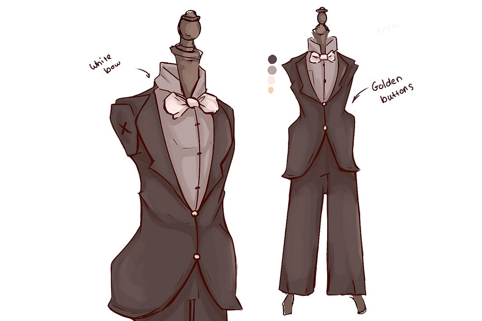
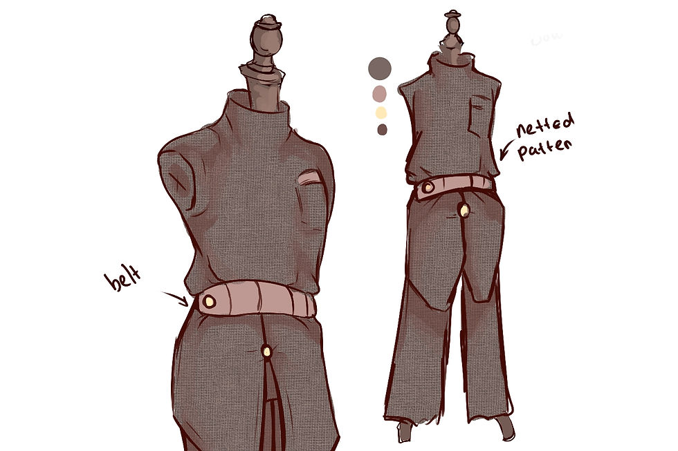

1. Dress idea one: This first outfit is a beige with a pop of red with the bow.It's main features is it's striped trousers and the main accents of red with his tied up bow-tie. I like the colour scheme this suit has and the use of red slightly shows his selfish nature subtly. Contrarily, adding the small details of the trousers in a pixel canvas of 96-96 it could be difficult to achieve properly.
2. Dress idea two: This next suit has a more darker coulor pallet with white accents. It's main features are it's open collared suit with a pop of white with his tie. I like it's use of coulor scheme showing us to the player this guy might be shifty at lest compared to the other brighter npc's. However, this type of appearance feels contrasting with the green mans coulors and doesn't give the impression of wealth so I might not use this design.
3. Suit idea three: This dress is a lighter brown and has the vibes of something a simple yet wealthy. It's main features are it's striped patterns and white belt. I really like the pattern aspect if the outfit since it will make the character very recognizable and gives him the appearance of a high class man. On the flip side, I dislike the lighter coulor scheme as while it is realistic for the rich the colour look to washed and the bright lines are quite distracting and pulls attention , which he doesn't want, I feel like this suit is to simple for this man.
4. Suit idea four: This final design is a darker simpler shirt and bottoms. The main features are it's netted design and a lighter contrasting belt. I like the netted and more textured look this design has, which makes him stand out and look more old fashioned. However, I dislike the coulor scheme due to it looking very out of place in the world, this makes his design look more unappealing and hard on he eyes since he stands out to much compared to everyone.
1
2
3
4
I have chosen the first design for the 'grey man' due to it fitting his character well. I think this due to the blander colour palette mixed with unique elements liked the patterns on the trousers; this also implements the style of a high class man To incorporate this into my FMP I will re make my sprite to incorporate these new details to improve his design.
Rat

This design idea is for the Rat. The main core aspects with this character is depicting and animating it as realistically as I can to a real life rodent. This presents the design ideas as viable for what you could find in the real world , will adding unique aspects to make it stand out as it's own play-able character. The vast amount of coulor palette ideas make this design interesting.


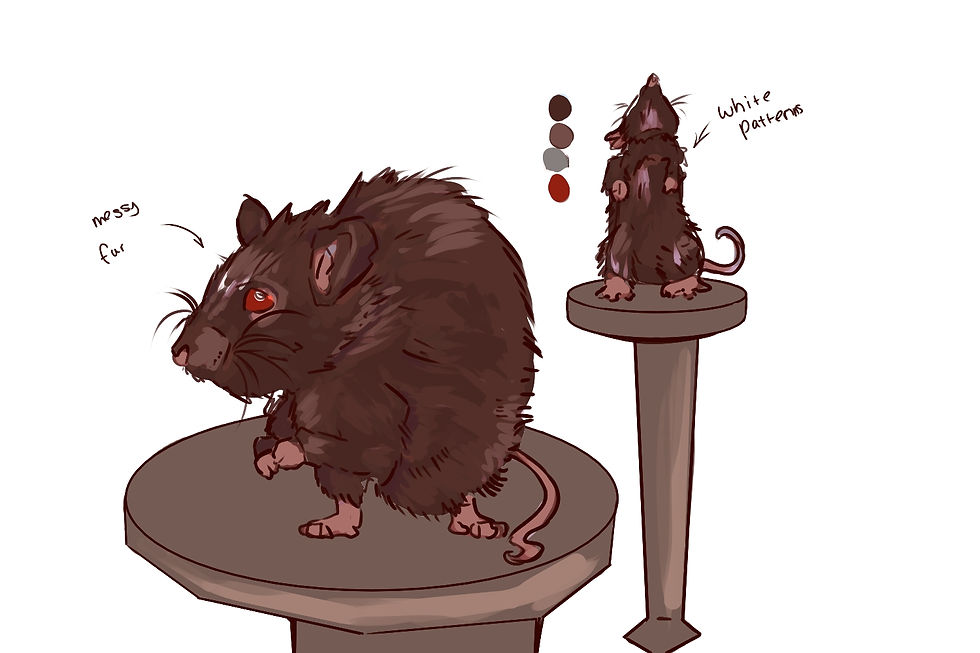

1. Fur idea one: This first coat is a white fur pattern with bright red eyes. It's main features bright dangerous red eyes accompanied by it soft white fur giving contrast. I like the colour scheme this coat has and the contrast of the eyes make this design not only recognizable but realistic. However, making this work for a 2D flat character could be hard since he might not bend well into the backgrounds and stand out to much.
2. Fur idea two: This next coat has a more simple design of just a bland dark brown colour scheme. It's main features are black eyes and reddish brown fur and skin. I like it's colour to blend into the 2D surrounding easier and make the game more realistic. However, this type of appearance feels to boring and underwhelming, I feel like if I choose to make the fur a dark brown I need to add accent colours or patterns to make it more unique.
3.Fur idea three: This coat is a lighter brown with some pattern elements. It's main features are its white stripes around the brown fur giving more personality. I really like the pattern aspect if the coat since it will make the character very recognizable and help give the vibe as a play-able character. On the flip side however, I dislike the colour scheme for the eyes as making them to bright or dim makes the coat look unappealing, while I like the patterns this shade of brown doesn't work to well in contrast to the world it's in.
4. Fur idea four: This final coat design is the darkest shade of brown with red accents .It's main features are it's black coat with some lighter elements and it's beady red eyes showing danger. I like its bright and bold aesthetic with is contrasting darker accents to make a unique design. I however, dislike it's darker palette as it's to dim for the environment and sticks out to much, to prevent this I could make a design were the coat blends in but not to much that it gets lost but maintain an aspects of making it not to obvious that it's there.
1
2
3
4
I have chosen the first coat idea for the 'rat'because I really like the light/contrasting coulor scheme I have chosen for this characters fur. I like the small details like the red beady eyes that indicate subtly that they are a danger to people and give the design a unique flare.To incorporate this into my FMP I will re make my sprite to incorporate these new details to improve his design.
Plague Doctor

This design idea is for the Plague Doctor. The main core aspects with this character is depicting and animating it as realistically as a real life plague doctor. This presents the design ideas as viable for what you could find in the real world museums and books, .The small amount of coulor palette ideas make this design interesting and cohesive.

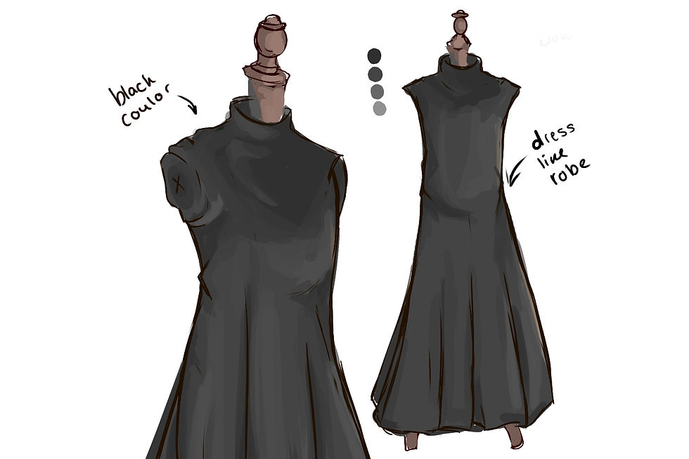


1. Design idea one: This first design is a orange coat with a leather shoulder trim. It's main features some bright orange hues and sickly saturated coulor pallets. I like the colour scheme this coat has and the contrast of the other NPC's makes this design not only recognizable but realistic to the real life plague doctor. However, making this can be hard since he might not bend well into the backgrounds and stand out to much and make him to obvious for the player.
2. Design idea two: This next design has a more simple design of just a bland dark gray colour scheme. It's main features are black and long dress like robes. I like it's colour to blend into the 2D surrounding easier and make the game more realistic. However, this type of appearance feels to boring and underwhelming, it also doesn't mach up to the realistic depictions of old plague doctors.
3. Design idea three: This coat is a lighter brown with some blood stain elements. It's main features are its bold colours with the hints of blood stains around the coat.I really like the pattern aspect if the coat since it will make the character very recognizable and help give the vibe of a real plague doctor. However, I feel like this design is overwhelming to the eyes and it would be hard to convey the rusted blood elements on a 2d side on model.
4. Design idea four: This final design is the darkest shade of gray with a long knee length coat. It's main features are it's dark brown/gray colour palette being realistic to the time. I like its simple aesthetic with it just being a solid colour as it makes it a recognizable design . To contrast, I wish I could add more distinct items to their clothes like the leather neck brace but I didn't fit well into this design.
1
2
3
4
Butcher
I have chosen the fourth coat idea for the 'Plauge Doctor 'because I really like the drak gray coulor scheme I have chosen for their design. I like it's basic nature and how it corlates to real world examples of plauge doctor uniforms. I will relate this to my FMP by using this design to make a recognisable character that can easly be identified.

This design idea is for the Butcher. The main core aspects with this character is depicting and animating a chacter that can only be real seen from the waist up. This presents the design ideas as viable for what you could find in the real world , will adding unique aspects to make it stand out as it's own unique character compared to the other NPC's. The vast amount of diffrent colthing ideas ideas make this design interesting.

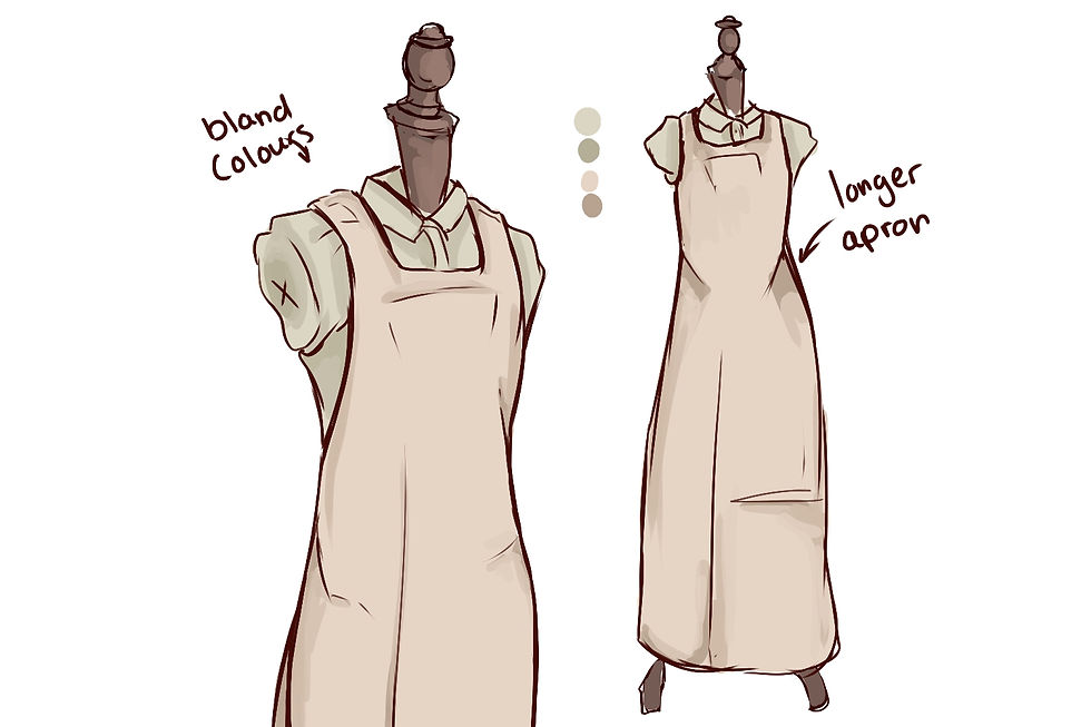


1. Design idea one: This first design is a buttoned up shirt tied with a blue and white striped apron around the waist. It's main features bright blue and white apron giving him a pop of pattern and colour making him stand out more. I like the colour scheme this apron has since it contrasts the rest of the outfit making it stand out. However, since he's behind the counter the apron wont be shown making the point of adding detail to it a waste of time.
2. Design idea two: This next outfit has a more simple design of just a beige colour scheme with a fully body apron. It's main features are high cut apron covering his body. I like it's colour as it would make him stand out in his butcher background. However, this type of appearance feels to boring and underwhelming, I feel like if I choose to make the clothes more bloody or torn to make his personality more of a brute than a clean gentlemen.
3. Design idea three: This coat is a dark brown with some red and white pattern elements. It's main features are its red striped tie, brown collar shirt and white high cut apron.I really like the pattern aspect if the coat since it will make the character very recognizable and I used elements I like from prior designs to improve this one -high cut apron and darker colours. On the flip side however, I worry since the colours are similar to the background for the butchers I fear he might blend in to well and get muddied into the surroundings.
4. Design idea four: This final design is the lightest shade of white with blood red accents .It's main features are it's white coat with some lighter elements and it's distinct bloody stains showing danger. I like its bright and bold aesthetic with is contrasting darker red accents to make a unique design and fit in with the butcher setting. I however, dislike it's light palette as it's to bright for the environment and sticks out to much even with the blood accents, while it makes them more visible compared to other designs the white is to bright and bold.
1
2
3
4
I have chosen the third design idea for the 'butcher' because I really like the light/contrasting colour scheme I have chosen for this characters apron and shirt. I like the small details like the red tie that indicate subtly that hes a danger to the player and give the design a unique flare. To incorporate this into my FMP I will make a sprite that has these elements and fits into his surroundings.
Backgrounds
Background One


This first background is a small portion of and old Victorian street filled with people, homes and stores buzzing with a mix of rich and poor people. My inspiration was real building -ones in my mood boards- and compiling different homes and store-fronts to create a small room that is filled with unique places and makes the player not only understand it the Victorian age but that this is meant to be a town. What helps is the shadow like silhouettes , with Big Ben showing that's this is only a small portion of the city. I used the app Pixel Art and many techniques to improve the art. One being , blocking out the main shapes , then adding small details like bricks and door handles. Lastly, I added and extra level of shading - a dark blue- around the bases to elevate the buildings by adding shade creating depth. This impacts my FMP positively since by having a compelling background that can also tell a story about the time period and how people would of acted back then shows my ability to create immersion for a player.
Background Two


For the second background I used the same process to create a new and appealing backdrop. I re used the same block out due to it just being the back of the same buildings in the first background , by doing this I can give my world continuity and make the world seem realistic and connected as if it was a real street. I used the same art program and methods, using the base blocked out colours then adding details like bricks and dirt. On this background I made some intractable object sprites - such as the newspaper board- so to make it fit in the background I added shading that indicates its connected to the world. By doing this I can show my knowledge on shading and making sure objects don't look out of place in my surroundings. Adding all these details helps my goal in creating depth and an appealing background that makes the player appreciate the art. This helps with my FMP by having completed more art to elevate my game by having more than one room throughout the play time. this will help making my game less boring as it has more options.
Background Three


For the last background I created a simple backdrop of a more messy and dark butchers. Its filled with stereotypical memorabilia you would find in a shop - diagrams, meat hooks and even a displayed deer head. I used the same app and technique again , blocking , detail and over cast with shade ; doing this creates depth and appeal to players as the designs and object might intrigue them. By making the colour pallet much more bright and red I can create a sense of change in scenery with simple lighting showing that there's little to no out door light but a simple light bulb, giving it a more closed in feeling as we are no longer out side but high up on a shelf. This demonstrates my use of light appropriately to create a sense of closed in vibes compared to my out door backdrop. I also added objects such as the till and meat as important game play mechanics ; you can use the meat to hid from the raging butcher taking refuge behind the till. This impacts my FMP by having more fun game play with a complete change of scenery increasing my world building of this small street while making an engaging game.
Art Studies
The main goal with these art studies are to understand how to draw and or create certain things I personally have little to no experience drawing prior. This is important since it will not only improve my art skills but show my dedication to create a realistic end product for my FMP.
Rat Study
The main goal this art study is to understand the anatomy of a rat and it's different breeds. By doing this I can add my knowledge of researching and dynamic posing references to improve my pixel art due to making a more realistic rat character with a realistic animation like running or climbing to go along with it. This improves my FMP since it shows my attention to detail and ability to learn new skills quickly for my work.


Human Study
The main goal this art study is to understand the anatomy of different face types and how to convey personality. By doing this I can add my knowledge of researching face types with older and younger people, this is important since by learning basic shape language for faces I can convey a mix of age , silhouettes and unique designs. This improves my FMP since it shows my attention to detail and ability create character designs that are vastly different to each over.


Object Study
The main goal this art study is to understand the anatomy of different object types and how to convey realism. By doing this I can add my knowledge of researching types of objects and their uses, this is important since by learning basic shape language for usable objects. I can use this to convey silhouettes and unique designs. This improves my FMP since it shows my attention to detail and ability create designs that are obvious and realistic.


Peer Feedback
Feedback One
One idea I was giving by someone was the artistic idea of making the rat getting more sick/ decaying as the days go on. This would demonstrate the story aspect on the rat being a vesicle for infection as it slowly withers away and infects as many people before their body no longer can move. This relates to my FMP by the idea of using art to depict a story and enticing the player with it's historical accuracy of the plague ; I could use this feedback by editing a sprite to make the rat look more rotten.
Feedback Two
Another piece of feed back I was giving was to use darker shades in my rat design to make him pop out more. My original design had a brown rat and while I liked it I found it slightly getting absorbed into the background of my game. Feed back I was given was to ether make their fur darker or lighter to make them stand out more. This will improve my FMP because it shows how I can adapt with criticism to improve my game.


Feedback Three
My last piece of feed back I was giving was how well I created human characters that people can empathize with. He said that seeing the damsels sprites of her vomiting and crying made him feel sad and pity her state of illness ; I can infer that I accomplished my goal in making theses simple pixel sprites with no backstory than their appearance and personality compelling just by body language. I will incorporate the theme of emotion in my FMP by pushing more dynamic body language to create stronger emotion.


Amended Designs
Blue Women/Damsel


This is the blue women / the damsel and their one out of the 5 walking NPC'S in this game. Her colour palette is cool blues with a contrasting light blonde. They are a young women who has a bubbly and care free personality that doesn't understand how harsh the world can be. Her outfit is a royal cut of cloth showing her wealth and her long maintained hair shows her money. She will get upset when bitten and run crying drawing a crowd of the people -making them aware of you that can become a problem late game- and even might be swooped up and saved by the green man. She is very emphatic and squeamish and has a chance to vomit causing a scene. This character is important to my FMP due to having a character that can draw empathy to the player and a character that is an " easy target" and can be used for world building due to showing the range of people this plague infected including rich people.
Red Women/ aggressor


This is the red women / the aggressor and their one out of the 5 walking NPC'S in this game. Her colour palette is harsh reds with a complimentary deep browns. They are an older women who has a stoic and aloof personality that try's their best to get their own tasks done quickly as they can. Her outfit is a royal cut of old fashion cloth showing her older wealth and her tied up hair in a messy bun shows how quickly she want to be in and out of their . She will get angry when bitten and might have a chance to stomp on you and take some health and can be a problem in the beginning ; they also have a chance to be swooped up by the green man if he's bitten. However, she has a small emphatic and will give some money to the Vagabond on the other street showing a subtle kind nature. This character is important to my FMP due to having a character that can become a small enemy and obstetrical to the player by making sure they are ready to take the risk on biting her ; she also is a good contrast to the damsel both aesthetically and in a story way. Having the contrast of blue and red , young and old and bubbly and stoic with showing that while the blue women is blind to how bad the world is the red women is aware and try's to help out people in need.
Green Man/charmer


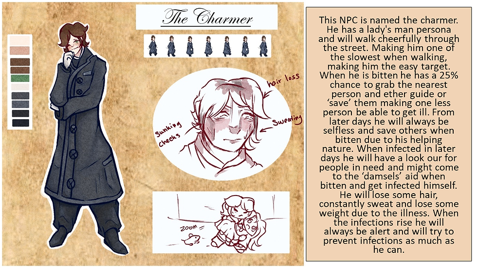

This is the green man / the charmer and their one out of the 5 walking NPC's in this game. His colour palette is pigmented greens and cool navy grey's to make his eyes pop out more. They are an young man who has a honest heart and kind attitude even if he can't read the room. His outfit is a long grey coat to make his more attractive features pop out more , such as his eyes, hair and freckles. He will get upset when bitten, but will try to have a brave face to not look weak,but he might have a chance to 'save' someone when hes bitten to be a gentle man and make sure the rat can't bite them if they are not on the floor. However, he doesn't realize that later on he will infect the people he is trying to save when he 'saves' them. This character is important to my FMP due to having a character that can become a possible tool to the player by making them use their own kindness of helping people to be his downfall. Having a character that want to help but hinders is a good way to present he has good intentions but doesn't think them through.
Gray Man


This is the grey man / the skeptic and their one out of the 5 walking NPC's in this game. His colour palette is muted beige and contrasting blacks to make his design more unique. They are an older man who has his aloof and dislikes attention so keeps his distance from people. His outfit is a long beige coat to be an homage to the Victorian era it was common form men to be in long coats. He will get annoyed when bitten, and silently be angry not to cause a commotion but doesn't believe the bite is any harm. However, he doesn't believe that he will get ill and thinks the younger people are exaggerating. This character is important to my FMP due to having a character that can become a possible tool to the player by making them use their own pride to be his downfall. Having a character that negatively views the other NPC's helps build character to my game.
Rat


This is the Rat, aka the playable main character of this game. You play as a rat infected form the black plague, carried by a flea that survived the 13th century. Your goal is to infect everyone in this town, causing the death toll to rise as for whatever reason want to cause chaos. Learn the behavior types of all the different NPC's and how they react to the infection and your presence. They are a small fluffy albino rat, with threatening red eyes infected with diseased written flea corrupting it's mind to blindly infect as many things as it can before 10 days when it's body gives out. You can bite, squeeze into holes and steal objects for your advantage to infect as many as possible, learn the NPC types and make your decisions carefully not to get your self accidentally killed. Having this character is important to my FMP by having a simple yet effective main character you play as , as having a rat being the one to infect people with the black plague rather than a human or zombie makes the game more realistic as the infection started with rodents infected by fleas carrying their disease and infecting near by people. It also creates unique and new game play mechanics as playing as a small rat creates unique animations and movement.
Plague Doctor


This is the plague doctor and is one of the most unique NPC in this game. Their colour palette is majorly dark and complimentary deep browns and blacks. Their gender , race and age is unknown, all that is known of these people in masks is that they have one job ; cure and kill. Their outfit is a long robe with a tied head piece supporting their bird like mask, with a small black hat helping improve their silhouette. They will be on the look out for any remaining rodents and walk up and down both streets ; if found they will instantly kill you and give you a game over, to prevent this you must hide in the small holes and shade while still infecting people to win. However,these NPC will come out in the later days raising the difficulty and making the game more interesting. This character is important to my FMP due to having a character that can become a main enemy and obstetrical to the player by making sure they are on high alert and think more strategically; they also is a good contrast to the normal NPC's both aesthetically and in a story way. They create problems for the player while keeping the theme on how in the 13th century they had plague doctor, yet if they were imported and adapted to the 19th century giving it some historical truth and realism to dealing with plagues.
Butcher


This is the Butcher he is a mini obstacle in the game. Their colour palette is majorly dark and complimentary deep grey's and reds with contrasting pops of orange to make him stand out. Their main goal is to watch the butcher shop for any rodents that might infect the food, he will kill any creature he sees that want to contaminate his food. His outfit is a long blood soaked apron , covering a long black button up shirt with a high collar. I has a distinct red tie to make his design more unique and has a long scar down his face. He also hides his ginger hair underneath his cap showing his dedication for work. If found by him he will instantly kill you and give you a game over, to prevent this you must hide behind the plates of food to avoid being in his line of sight. However,this is an optional challenge, a high risk high reward as by doing this you can have a plus 40 infection as you contaminated the food. This character is important to my FMP due to having a character that can become a small enemy and obstetrical to the player by making sure they are on high alert and think more strategically; they also is a good contrast to the normal NPC's both aesthetically and in a story way as they also create problems for the player
