Brooke Steele

Task Two
After analysing practitioner work, I will experiment with specialist tools, materials, and processes across the four fields: Games Design (Level Design), 3D Art and Animation, 2D Art and Animation, and Programming.
I will create work such as grey-box level production and small cutscenes for Games Design, character sculpting, rigging, and keyframe animation in 3D, sprite sheets and concept art in 2D, and class-based scripts in Programming. My focus will be on the experimentation process rather than finished outcomes.
I will document my progress in a time- and date-stamped development diary on WIX, including visuals to show what I have attempted. I will explain in each entry how I used the tools, how my approach reflects professional practices, and how I followed ethical guidelines. I will also reflect on whether I am satisfied with my outcomes and note ways I could improve or refine my work. This process will help me build skills while linking my experimentation to industry standards and creative intent.

2D


MENU
10th -19th

This assignment is the task : Identify : Define the task: recreate a game level in 3D (Unreal Engine 5) or 2D (based on a 3D game). Focus on visuals, not functionality. Discover: Brainstorm possible levels, select one, research references, and create an asset list. Apply: Model, texture, and build the level. Check: Review the level’s quality, refine assets/lighting, get peer feedback, and present the final outcome. I have choosen To make a 3D game into a 2D game as my 3D skills arn't as pernoinced as my 2D skills, I also want to focus more on 2D as it will be my specialized field.
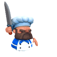
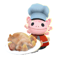
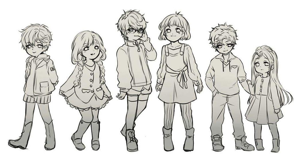
The game I have chosen is the 3D game Overcooked by 'Ghost Town Games' playable on most consoles and PCs. It's a fun comic game where you have to complete food orders in many different environments with different obstacles to overcome. This game is very great with over 2 players as it has multiplayer and co-op play as you can steal, charge and sabotage your friends. I have chosen this game due to its charming style of cartoon creatures; not only does this game seem to be able to translate very well into 2D, I think I could be able to not only recreate the style in 2D but use its charming aspects to improve my 2D assets and my overall work by learning a new style medium.
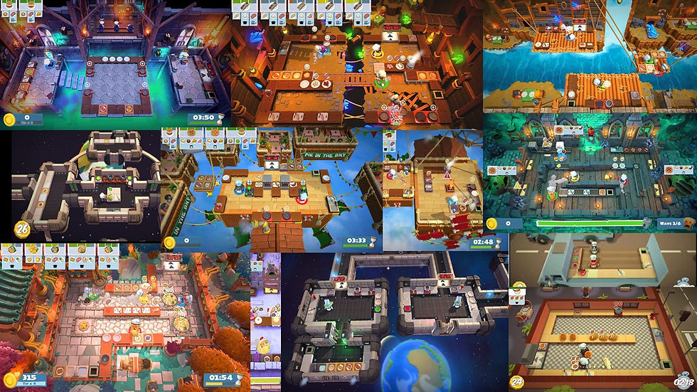
The main aspect of this mood board is to show the range of ideas the development team has in these levels. Also, how do they change the layout to match with the backdrop.

The main aspect of this game is the challenges in the levels. This shows ways the devs use the world to change the ways the map can change (ice separating platforms, moving platforms, etc.).

The main aspect of this mood board is to help me start the process of the concept art by having a good plan on how to begin level creation.
The main aspect of this mood board is to show the range of ideas the development team has in these levels. Also, how do they change the layout to match with the backdrop.
These mood boards are colleagues of the many types of levels in the game. They show: the many different themes in the game, how they incorporate challenges, and how I should base my 2D level layout.

The main aspect of this mood board is to show the range of designs Overcooked has in their game, such as humanoid characters and non-humanoid.

This mood board is to show the range of different types of people the game has, using different face and nose types to create distinct characters that don't suffer same face syndrome.

This mood board is to show the range of different types of animals the game has, using different anthro characters to make the game look more cartoonish, like by adding cute creatures, as it makes the game appeal to more people.
The main aspect of this mood board is to show the range of designs Overcooked has in their game, such as humanoid characters and non-humanoid.
These mood boards are colleagues of the many types of character designs in the game. They show: their roster of the overarching game, what the humans' characters look like, what the non-humanoid characters look like.

This mood board is to help me aid in making food sprites that look appealing and fits the aesthetic of the game.

The idea of this mood board is to help me think of ways to implement UI in my work. Making sure it fits the overall game and how clear it is to the player.

The aspect of this mood board is the idea to create helpful and interesting loading screens to not bore the player and even help them with the game.
This mood board is to help me aid in making food sprites that look appealing and fits the aesthetic of the game.
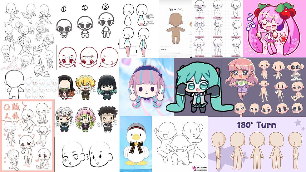
The idea of this mood board is to help me understand the basics of the chibi art style. By focusing on making features like the eyes and head bigger and hand and feed small and simple to create a cute overall look.

The GIF is to help me understand the cartoon like flow chibi animation has. By exaggerating movements to make the character look more funny and endearing.

This GIF is to see how to make a cute yet simple idle animation of a chibi character. By looking at how the hair swings and the simple face changes it makes the character look more cute and interesting.
The idea of this mood board is to help me understand the basics of the chibi art style. By focusing on making features like the eyes and head bigger and hand and feed small and simple to create a cute overall look.
These mood boards are colleagues of the range of UI and models of food. They show: the range of 2D and 3D food, the basic UI for the game such as pause menu and ending screen, intermission and loading cards that help the player.
These mood boards are colleagues of the many ways I can incorporate a chibi art style. They show: the many styles of simple yet effective chibis, ways to animate them, and interesting idle animations to add personality.
Ideas/ End Goals
. Make a possible small demo for this 2D adaptation showing my assets.
. Create charcacters the fit in this game world.
. Complete a full asset sheet of characters, levels and UI.
. Explore ways to make a 2D cartoon like game look like its 3D counterpart and learn new skills.

To demonstrate a stylized running animation.

To demonstrate an exaggerated features, such as particles.

To demonstrate the range of possible foods.
To demonstrate a stylized running animation.
At the end of this small challenge I want to develop a skill of both time management on making assets in a bit over a week and to also practice on cartoony art styles in both exaggeration and simplifying features to make them look distinct. An example Overcooked has its iconic huge pear bodies and big noses.
One thing I want to take away with this game for future projects is, if i want a cartoon like style I should add exagration in the running and idle animations, also adding small particles help to improve the cartoon aspect.
My Test's/Concepts
Click onto images for more information
* This link to my overall assignment to create a 3D game/ level into a 2D game/level by having me explore a 3D game such as Overcooked and using my 2D art skills to create accurate recreation to make this work.
* My overall thoughts on how to create this 3D to 2D game is to focus on the cartoon like aspects and make interesting signs and layout.
* I first looked at ways to translate the Overcooked style to 2D, I did this by making concept art on different face types seeing which looked the best and looked the the game. Next I made body references to help me when I draw the final outcome. I then make concepts for different face types to see if I can replicate the style well before moving onto the assets.
* I then traced a screen shot of the level to see what perspective it was in to help me in the future. After that, I drew to ideas on how I can make this 2D level, either top down or semi 3D, I choose semi 3D since I thought it matched the best with the game. Lastly I added shade and texture to see what a finished product could look like.
* I did all of this by using Krita (drawing platform) and using my prior skills to help me create this art.
* To improve this next time I might focus on more of the UI and food aspects to make my references stronger.
* I have noticed while drawing that Overcooked likes to exaggerate movement and push anatomy to create more memorable characters.
* To correlate this 3D game to 2D i have used its characteristics to make a fun and accurate 2D version.


My 2D assets


The first assets I made for this task was the playable sprites ; I used my concept art and in Krita made folders for each character (Blue girl / Blue boy). I drew a front facing view and side facing view with each important component split apart: face, hair, hands, apron. I then put the pieces together and hand tweened their body moving they way I wanted it to and converted them into GIF's for GameMaker. I learnt from creating these assets that folders and naming assets are important to help sped up the animation process.


After making my 2D playable Overcooked characters I moved onto creating the environment and level to create a semi-playable 2D game. I used my personal references and decided to use the semi-3D perspective as I think it would not only be more interesting but help my sprites pop out more ; I then in Krita drew out the base of the level and maybe separate images for each appliance (sink, stove and bins for example). I have learnt from this that having a good perspective on your levels and backgrounds and drastically improve your games visuals, I will learn to experiment with perspective to make my games more appealing.
Lastly, I created simple food PNG's and hazard PNG's to make the sprite be able to grab the correct items and being a visual aid if the player is playing the game correctly. I made a folder of each food in different stages such as the tomato going from a full one to a cut up one. However, due to the one week time limit i decided to add a simple smoke animation to transition from one food to another variant from it. By doing this I can give the illusion of movement while making my game still seem professional. This small practice helped me by seeing there are ways to simply improve something rather than leaving it blank.


In this small starter project I have learnt different perspectives in creating backgrounds, how to make hand drawn animated sprites and how to lay out my work in a nice and appealing way. My final thoughts on this week long project as a whole is I feel like I captured the Overcooked style well into 2D as it looks game accurate, I feel like I have also created expressive sprites and a clear and appealing background. To improve for next time I will see if i can find any 2D art animation software to make animation more easy.
Additional Exploration
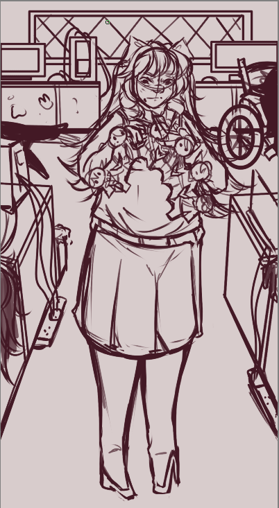
For these drawings I was exploring character design in my main character/villain of my game. Looking at things such as recognisable colour palettes, silhouettes and characteristics. I have found a good palette and silhouette for this character as she stands out as someone with bad intentions from just her design alone; such as the white contrasting with the bright accents of red in her eyes showing a wolf in sheep clothing.

I wanted to explore composition styles in body character posing and colours to make recognizable character photographs and artwork. I used inspiration from artists who use borders in their composition to show off characters to help push my designs. I added chibi versions of her design, a close-up face design, and half body and a posed body to help express her personality without needing writing.


This design is from my past FMP (2024) of my female 'damsel' character. I have used soft conners on her silhouette to make her look kinder and innocent with a nice cool colour palette to present her character as a sweet young woman. I feel like I have accomplished making a character design that shows How she is a good character with the use of general colour theory and design theory.

Style Exlporation / Style Implementation
For this 2D task I wanted to experiment with my art style and characterization of pre-existing characters. I wanted to see how I can develop a character into my artwork using my skills to give more detail in both the character's backstory/important elements and using other people's media in my work to show how I can make the character a model similar to the original design. This task will help me adapt to other people's work to create new ideas on how to explore a character's design further and help me use worldbuilding to create an accurate version of a character.


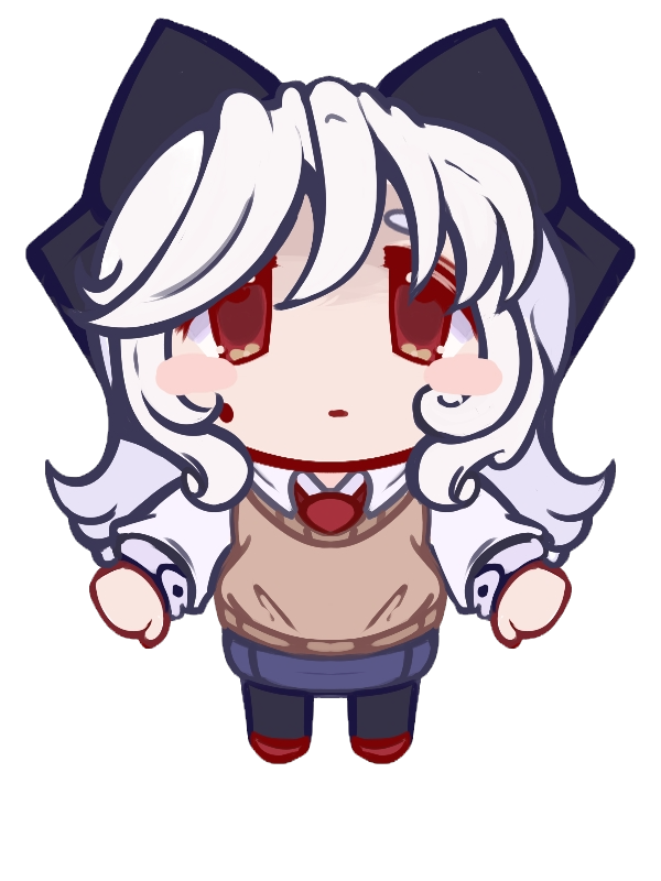
The character 'Abiddon' is from the (2025) 'Netflix' show 'Haunted Hotel'; he is a demon character possessing the body of a young Victoren child. While I can say the Victoren child aspect in his design is very clear (from the clothing and hair type) besides his voice he just looks like a young teen rather than a youngchild or a demon. I wanted to create a desgin that both showed the fact that he is wearning someone elese body rather than him just looking pale and angry.


Finished Design
Progress Photos
Uncanny Valley
What is the phenomenon of the 'Uncanny Valley'?
The uncanny valley is a concept where a nearly human-like object, like a robot or CGI character, creates a feeling of unease and discomfort in human observers.Our brains are wired to recognize and respond to human faces, but when something looks human but lacks subtle, correct expressions, our brain registers it as "wrong," causing a feeling of discomfort. I wanted to convey this feeling with my stylized design as he is a demon body snatcher character.

Child Proportions
How to create child characters that look young?
To make a character look young, adjust their proportions by making the head large relative to the body and placing facial features lower on the face, particularly the eyes and nose. Other key features include using soft, round shapes for the face and body, simplifying and rounding features like the nose and mouth, and giving the character large eyes. I made sure his proportions were short and stubby and giving him wide eyes for not only showing his demon nature but also making him look younger.
When drawing Abiddon in my own style I knew I wanted to push his dead demon side out more with his design without going overboard; I have done this by making his eyes stand out more and look out of place yet still looking like a human, pushing his hair to look more sharp and unnatural and adding bright red veins to show that something is wrong.I also pushed the Victoren boy style by making his buckles bigger and adding a small pattern on his trousers and shirt making it look plated. By doing this I think I captured his moral design well and made his backstory implement well into it.
What I have learned
By doing this practice task I have used new rendering and shading styles to help elevate points in my art. For example, using textures in 'Krtia' to help make clothing more realistic and interesting, I have also used a semi-cell shaded shading style where I create harsh shaded lines with airbrushing detail afterwards to make the shading look more unified in the drawing. I have also used rendering on top of the sketch to make him look more uncanny as using the rendering and the shading together gives a feeling of it being unfinished yet it is finished.
Anatomy Practice
The main reason I wanted to do this practice is that learning anatomy helps artists create more realistic, well-proportioned figures by providing a foundational understanding of the body's underlying structure, including bones and muscles. This knowledge is crucial for accurately depicting a figure's weight, movement, and emotion, and it allows for greater creative freedom by enabling artists to construct accurate poses from memory and apply changes to a figure's form more effectively.
This video demonstrates the main basics on how to draw and plan out anatomy when drawing poses and in general art to make sure all the proportions make sense to the eye.This will help me improve my artwork overall.
This video goes into depth on how to create body movement that looks natural, especially with characters with a high muscle density.This can help with future characters with lots of muscle and basic animation of realistic movement in characters.
I have practiced using basic shapes to create proportionate anatomy to be able to improve my overall drawing process and create stronger artwork for both my portfolio and own practice studys.
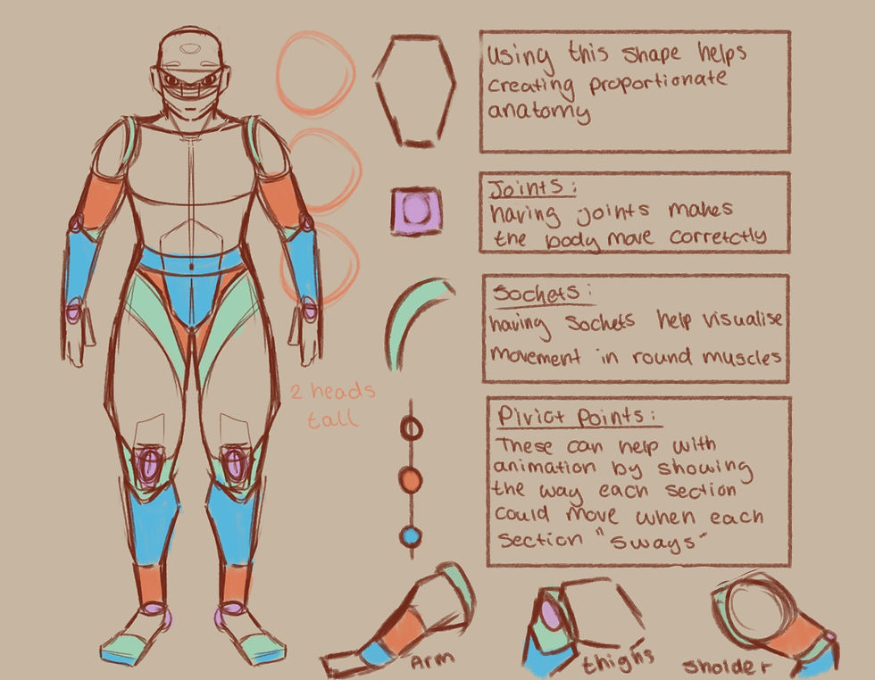
I have practiced drawing using my references with both videos and the linked buttons to be able to understand basic anatomy and how to simplify it for future use. I have learned simple ways to make more realistic bodies and poses using shapes such as hexagons as a basic shape outline of both legs and arms as they have the same shape of muscle flow. By using joints as a pivot point for where the muscle bends and how far it bends, I make sure my movement and posing are not only dynamic but accurate.Using sockets can help me visualise how the shoulders and thighs swivel inwards and rotate naturally like a mechanism as this helps make 3D angles more exaggerated yet realistic. Animation-wise I can use swing points to mentally demonstrate how when one muscle and body part moves, the others slowly move at the same time like a pendulm motion. By learning this I can animate humans and creatures more smoothly as it will look less ridged.

I have sketched out the main body parts I have struggles with in different angles such as feet and hands to make sure I can draw them correctly and propionate to improve my art overall in both future 2D work and my portfolio.
I have also used the knowledge of using shapes to outline the main figure of the body part such as hands and feet as they are the main things I struggle with drawing. I used real references of people to help make sure my drawings looked accurate; I also added arrows to make sure the main flow of the hands and feet are going and pushing in the certain direction.I have marked out the main palms / base of the feet to be able to see clearly what the base of the feet and hands shape should look like and move like.I also wanted to practice angles in the main things I struggle with to improve my 2D art and be able to make myself more confident in drawing more dynamic angles and make my works more interesting. By practicing, I can show people how I want to learn and improve in things I am comfortable with to make sure my work is also going up in skill rather than being stagnant or decreasing in skill.
What I learned from this
I have leanred that anatomy can help you understand the standard proportions of the human body, allowing for more accurate and lifelike representations. This includes understanding the relationship between different body parts, such as the head, torso, and limbs.Another thing I have learned while practicing is that now I know the location of muscle groups and the function of joints; it allows you to draw figures in more dynamic and natural-looking poses, as it can help you avoid creating unrealistic or stiff-looking movements. The main reason I wanted to do this practice is to help improve my confidence in drawing by understanding the underlying structure of the human body can give me more confidence to draw figures from imagination and to adapt poses and angles that I haven't seen before.

2D Sprite Creation

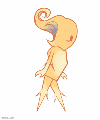
To begin with, I started to design my 2D character. I wanted to create a design that looked cute and small, with the main element being that they are an entity of light. I wanted to create a stong silhouette that resembles a mystical creature by having their head be exaggerated and memorable so I based the shape on the painting 'The Starry Night' using the swirls in the painting to make the character look more mystical. By making multiple designs and picking a strong character design I can show my planning skills as reasoning in why I have used aspects in my characters, which shows my research and idea generation skills.

To improve my character's design, I created a colour sheet to see which groups of colours looked the best for this character. My main point in this was to have them look like a being of light and have some aspects of blue/green to emulate my references. By using different colour combinations, I can show why certain colours work and how they affect the characters' overall design differently. For example, the red design makes them look more dark and stand out a lot, while the soft yellow colours make them look more like my overall goal in their design and look more like light.

To explore my characters' personality more, I created sketches to present how my characters express emotions and how they express their body language. By doing this I can show people simply how my character will act without needing to explain as from this image you can see this character is very meek and tiny, needing to push their body to move further (such as wiggling his legs to move when swinging). This helps with convaying emotions in a character instantly helps me with referencing the characters' sprites in the future by looking at the sketches.
Idle Sprite

To make the idle animation I wanted to create a simple breathing and bouncing animation. I also wanted to make their head swirl to make the character look more unique and alive, showcasing the aspect of being a being of light by the 'flame' moving around. I first sketched out the main silhouette of their body and creating a clear outline for each body part ready for line art, colour to making tweening the body easier. To make them look bouncy I used 'Krita's' movement tool too pull their body up and down to make them look like they have weight. By sketching out my body parts I can make sure that my work is always accurate and by reusing the body parts of other sprites

For the finals sprite/animation I used my references to outline each body part ( legs, arms, body and head) and made them separate layers ready for tweening. However, for the head I drew 3 different sprites to make the flame effect look seamless throughout the animation, after having all the pieces I started to use the movement tool to move each limb and stretch each limb for smoother movement. By doing this I can give my character a hand had feel to them as they move a bit like liquid, which helps carry the swirl and light motif. Finally, with the 6 different frames I converted them into a GIF to be ready for engine like 'GameMaker'.
Walking Sprite
To make the walking animation I have reused the same sprites to keep them on model and used they same animating technique as before. However, I faced a couple of issues, for starters due to the legs being the same I struggles with animating as I kept forgetting, which one moved first. Secondly, when animating the walk cycle looked off as they seemed to walk very stiff, which goes against their personality and character. To fix this I added a blue gradient to the other leg and arm to make animating easier but to give more of an interesting design as I tied the blue in their head back into their design.

The revamped walking animation is a lot better than my first draft as you can now clearly see how they character moves around, elegantly as they slide across the floor a bit. Also by redoing the animation I have improved the over all flow making them look less stiff and more alive. Another small change I made was angling the body downwards a bit to make them look like they are watching every step and to help give them more movement when they walk.By remaking the animation I show the ability to see when something can be better and use my ability to retry showing dedication and they ability to take self criticism in my work without giving up.
Jump Sprite

When making the jumping animation for my sprite I wanted to emulate the feeling of them propelling their body forward to get more range and height. This shows that my character is small and light help with the immersion of my world and helping to give them a cute factor by showing how they put everything into one jump to make it across the platform. Having a flow like jump animation will help my platformer stand out as by giving my character personality through body language helps create a stronger narrative that they are hardworking yet elegant as they jump with grace and purpose.

My final result shows my character running up and leaping, by using what I have learned from the walking animation I kept the blue shaded legs to help differentiate from each leg. Another thing I have added to give them personalty is making them squint their eyes when they leap, this shows the player that they are exhausting the strength to make sure the jump can reach far enough as well helping their over all character appear more cute as people resonate with small creatures trying their hardest to complete a goal. This sprite animation will help create a cozy feeling in my game with a small and cute protagonist with them always wanting to persevere and reach the end goal.
What I have Learnt
While going through this project in creating my sprites for a platformer I have learnt many skills in both animation and planning. I have learnt the best way to plain a simple character in a short amount of time is by creating concept sketches, concept colour's and simple environmental interaction sketches. By doing this I can have a concept design with appealing and correct colours and by putting them in my idea of a world to see if they fit or need to be changed. While this process will be used in my other bigger games I will add more such as reference sheets but for a small project this level of planning and concept art will help my characters always feel explored fully.
Animation wise I have learned the art of hand tweening, which is when you have png's of each characters limb and you move it by hand to give the illusion of movement and animation without needing to either rig or redraw frames. The main thing I have learnt are pivot points, they help to make movement feel more natural as I struggled at first since the movement looked stiff and constantly moved to much in each frame but after I put the points in the correct spot moving felt more natural as they swayed correctly (example putting point on the top of the thigh to make the leg movement feel real). By reusing my png's I could also make sure that my work was always on model and saved time, as redrawing each limb for each sprite animation would not only take a lot longer but has the issue to be out of proportion, so I have learnt to create finished png's to make animating quicker and smoother.
For next time I do wish to learn and use a real animation program so I can develop skills into create 2D hand animated animations and or sprites. I do have the animation knowledge such as the basics laws of animation, how onion skin works, layers, adding effects and shading in post production I however, have not used a real animation software. I would like to learn how to create scenes in animation for my games not to only have a stronger portfolio but to improve my skills overall. By learning those skills I can be a strong contender in the 2D games industry since even if my employ work has no animation in it I can prove I have the ability to do so if needed making me a better candidate for jobs and overall art hiring. I will find animation software in the future and practice in my free time to develop my skills for higher education and or employment.

Colour Theory
What is it?
Colour theory is the study of how colours work together, and it provides guidelines for creating effective color palettes. It is a science and an art that explores the relationships between colours, how they are perceived, their psychological impact, and how to use them to communicate a message. A fundamental tool is the colour wheel, which organizes colors into primary, secondary, and tertiary categories.
-
Primary Colours:
These are the foundational colours—red, yellow, and blue—that cannot be created by mixing other colours.
-
Secondary Colours:
-
Made by mixing two primary colours:
-
Red + Yellow = Orange
-
Yellow + Blue = Green
-
Blue + Red = Purple


Psychology of colour
The psychology of colour is the study of how different hues influence human perception, emotions, and behavior. Colours can evoke feelings, impact moods, and even cause physiological responses, such as warm colors (red, orange) being associated with energy and excitement, while cool colours (blue, green) are linked to calmness and relaxation. Responses to colour are shaped by culture, personal experiences, and context. An example using my own artwork, for my past FMP I have created a game banner showcasing both my characters and my overall aesthetic / backgrounds. I have used a red tint and backdrop to create a small feeling of danger making the red women blend in to maybe imply she is also dangerous. Yet by having my other characters either be the opposite of red or other colours I show that they are also innocent bystanders in my game.

Hues,Tints and Shades
A hue is the pure, dominant color family, like red, blue, or green, that identifies a color and excludes white, black, and gray. It's the fundamental quality of a color as it appears on the color wheel, before other colors like white, black, or gray are mixed in to create tints, shades, and tones. A tint is a lighter version of a color, created by adding white to a pure color (hue). For example, adding white to red creates pink, which is a tint of red. The term is also used for a subtle amount of a color, a dye applied to hair, or a light-colored film applied to a window. A color shade is a darker version of a pure color (hue) created by mixing it with black. Adding black increases the color's darkness and depth, and the amount of black determines how dark the shade is, ranging from a slightly darker color to almost black.
Colour Wheel
A colour wheel is a circular chart that arranges colours to show their relationships, based on: primary, secondary, and tertiary hues, highlighting visual connections like complementary pairings. Invented by 'Sir Isaac Newton' to organize his studies of light and colour, it is a fundamental tool in art and design for understanding color mixing, harmonies, and schemes. It serves as a basic reference for understanding how colours interact, mix, and create different moods and effects. A triadic colour wheel example uses three colours evenly spaced around the colour wheel, forming a triangle. An example of analogous colours on a colour wheel is the grouping of red, red-orange, and orange. These are analogous because they are three colours that sit next to each other on the colour wheel.Examples of complementary colours, which are pairs of colours located directly opposite each other on the colour wheel, include red and green, blue and orange, and yellow and purple.


RGB Vs CMYK
RGB is an additive colour model for digital screens, using Red, Green, and Blue light. CMYK is a subtractive colour model for printing, using Cyan, Magenta, Yellow, and Key (Black) inks. RGB has a wider colour gamut, creating vibrant colours on screen, while CMYK has a smaller gamut that is best suited for printing. You should use RGB for web or digital projects and CMYK for any print projects, such as business cards, brochures, or flyers. In art, the RGB model is used for all digital media and displays, as well as for some specialized, high-quality physical prints like fine art prints or art installations. Using my work to demonstrate, in this art piece I have used my characters main colour scheme ( deep teal) and used it as a block out so she stands out from the bright pink background. This helps with contrast and makes the art more appealing .
Colour Proofing
Colour proofing is the process of creating a sample print to accurately show how colours will appear in the final, mass-produced version. It's a crucial step in the printing industry to ensure that the colors on the final product match the client's and designer's vision, catching errors before a large, expensive print run is completed. A colour proof can be a physical print, called a hard copy proof, or a simulated view on a screen, known as a soft proof. An example of colour proofing that I have used is in my platfomers sprite experimentation , where I looked at the pro's and con's on certain colours being using on the playable character. By doing this I can see how the character looks to the naked eye without environmental lighting or effects. This helps me make the best judgment on what looks the most coherent.
An example of how I can use colour palettes to create attractive , eye catching designs and artwork ; I show this by using this colour palette for my website section
More in depth exploration on colour theory using SlikSong
For my future 2D work I will use colour theory to improve my artwork overall, I have learnt : colour wheel formatting, RGB /CMYK ,colour proofing and overall what makes a good colour scheme.
3D

This tasks end goal is creating a 3D low-poly plane and animating it. This task is to help showcase my 3D modeling, metrical painting and 3D animation skills. By having this I show my competence with 3D animation.
I first begun by following the schools tutorial on how to make a low-poly plane one Blender. Firstly, I used a cylinder mesh and altered it using pivot points and faces to have a smooth cone shape. Then I used extracting and inverting faces to create the wings, I did this by using one side then mirroring the results at the end so I would worry about doing both sides. I extracted the wings out then changes and altered the vertacys to make the round and point in some places. Lastly, I beveled the front and extracted the middle for the plane turbine. I added another cylinder mesh and created the turbine by extracting the faces on the side and making them wing shaped by altering the vertacys and faces. To conclude with the model, I added a simple material paint on all of the plane making it look unique and personalized.
Key-frame Test


To begin the animation process I first made the body of the plane a parent object to the turbines so when I animate the plane moving up and down on the air the turbines can both rotate and move with the plane. Next, I went into the turbine object and started the key-frame animation ; I set the first frame to zero and the last frame to 240, then I set the rotation from both points to start at -90 and to end at 18000 on the Y axis. B y doing this the blades will spin very fast and have a small build up in speed around the 100 frame mark. I then moved onto the planes body object and added the same frames form 0 - 240 and kept in mid to have integers for smoother animation. I moved the body up and down for every 40 frames to look the like plane is bopping in the air and near the beginning and end made it either go all the way up or down for a take odd and landing. To make the animation more realistic I then ever 20 frames did a simple -15 /15 rotation on the Y axis to look the the plane is trying to maintain balance. By doing this my animation look realistic and like a real plane. Lastly, At the beginning and end on the X axis I rotated it either up or down to make it look the the plane is having a stronger take off/landing. This simple rotation already improved the animation as it looks like my plane has weight to it.
From this experiment I have learnt how to create simple low-poly 3D models from on mesh, this can help me in future 3D projects for I have a reference on how to use : faces, vertacys, bevels, extraction and inverting. I also have learnt how to add a simple martial colour instead of needing to UV and texture paint, this will help me save time on simple 3D objects. This experiment has also helped me understand 3D animation as I now know how to add key-frames and animate them, while I used my own animation knowledge to see how to make a good flying plane this experiment has made to process for future 3D animation easy as I can immediately go into it without confusion. To improve for the next 3D animation task I will see if i can add graphs to makes my animations cleaner and more complex as it can elevate my work

Pumpkin Task
I first began by following the school's tutorial on how to make a low-poly pumpkin in 'Blender'. Firstly, I used a sphere mesh and adjusted it to the size I desired and used extraction cuts /bevles to be able to make the lined effect on the pumpkin making it look more realistic. I then used a cylinder mesh to create the stalk of the pumpkin and used a shortcut to make both materials into one object. To create the eyes and mouth holes, I used a sphere mesh and duplicated it to make two eye holes and placed them in the wanted position. I then used the boolen tool to extract the sphere out of the pumpkin mesh, making the eyes. I then used the vertices tool and the mirror tool to be able to give the pumpkin some 'eyelashes'; I did it to help give my pumpkin more personality. I then downloaded a noise texture and created a material of an off-white colour and combined it with the texture to give my pumpkin depth. Lastly, in textured paint I gave the eyes some black burn marks to add more personality and uniquness.


My main reference for this 3D task is the more comedic and funny pumpkins with wide eyes and tiny mouths. I wanted to use this style of pumpkin to stand out from the other 3D models of pumpkins and evolve into a more cartoon-like style as I wanted to explore medians such as : exaggeration, body language, and stylization. I also wanted to use white pumpkins as another way to stand out and to help show my knowledge on lighting in 'Blender' better as you can see the yellow light stand out more.


Unreal

Maze Game Level Design
To experiment with blueprints and 'Unreal Engine 5' , as a class we have created a puzzle/ maze game. This project can help me improve my level design skills, 3D animation skills and 3D coding skills. I can also use the base code from this project to create future 3D project much quicker.
Lighting
After opening my Unreal level and setting up my folders, I went into the 'Modes Panel' and looked up 'Sky Sphere'. Then I dragged the light object into my view-port and search for the 'Sky Light'and the 'Directional Light' then dragged them both into my world. To make sure the light was center I set all of the lights coordinates to zero. In the 'Details Panel' I found the 'Directional Light Anchor' and rotated it's position to change the atmosphere (sunset vibes). Clicking 'Refresh Materials' made sure my light saved. I ended up with a purple/ pink hue to overcast my maze level
Using the light like this helps elevate 3D levels as game makers can create a simple atmosphere or aesthetic with just basic backing lighting. They can create a dusty sunset for a cowboy game, pitch black darkness for a horror game, or just a simple sunny day for a cozy game. This simple lighting practice in Unreal is used by most developers.

Describe your image

Describe your image

Describe your image
Describe your image
For my own future Unreal projects I can use this lighting technique to elevate my own game by having stronger lighting to convey a mood. By learning this I have the ability to use mood lighting to present things such as the type of world we are in , how the player should feel and the over all cohesiveness of the game. Lighting is important to creating a story as it shows how you show look at the world
Movement
I went into my blueprints folder and created a new blueprint character called 'BPplayer' and opened the blueprint. I then added a camera and made it a 'Static Mesh' so I could create a first person view by putting it on the player model. Then i dragged the player model in the world to test if I could just see in first person. To make the player walk I went into the 'BPplayer' event graph and added the following code seen by the images, then added the ability to move left and right seen by the other image. Lastly, the last bit of code shown is the movement of the camera so when the mouse is moved the camera follows it's direction.
A major of 3D games needs to have a character that can walk around the map so this step is curtail for if you want a playable game. Having a first person camera view helps to make the player feel more immersed in the game since it is as if we are seeing the world through our characters eyes. This is done to help people build connections with both the games world and characters.
Describe your image
Describe your image
Describe your image
Describe your image
In my own 3D games having a playable character that can walk around is important as having a simple walking first person camera makes the game playable. It also helps my game as having a first person walk through makes the player feel as if they are in my world and their choices hold more meaning as you put yourself in the characters shoes as you feel like you both are the same.
Materials
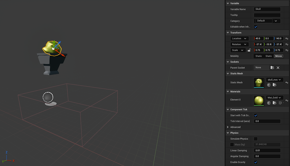
To create materials for my levels objects I created a new folder and called it 'Meshes' and create a materials actor. In the mesh editor I then used the keyboard shortcut - holding left click and pressing the 3 key- to get the constant 3 vector event. In the event you can use a colour wheel to create any colour you want. Next, I used the other keyboard shortcut - holding left click and pressing the 1 key- to get a constant 1 vector to be able to add more roughness and detail to my meshes. I did this until I had all the desired colours and meshes.
By doing this I can give my 'skull door' , my walls and my 'skull key' a golden or stone like material. Doing this will help elevate my level as it will make my objects stand out and look more realistic. This will make players in my level feel more like they are in the world I want to create as they will appreciate the cohesive design of the importance of gold and the simple stone.


Using the materials in 'Unreal Engine' I can make my 3D work look better as I can create meshes for : characters, landscape, objects and other miscellaneous things that could use meshes. By doing this I can elevate any 3D sculpt I make as I can give it texture and depth making my world feel more real and alive.
Interact
To begin to code my level I first created two blueprints for the 'skull door' and skull key' and created a collision box for the 'skull key'. After doing that I created a 'Platform mesh' to be able to pick up the skull when interacted ; by adding the code with the red boxes I was able to implemented a system where when the player presses 'E' the skull mesh will disappear and be saved until they interact with the door. To make sure that worked I also implemented a print string showing it interacted. To make sure the key disappeared I added the last code to make sure it will disappear and add to the players key count by one.
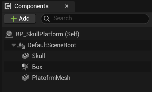

By implementing this code I will be able to make this level playable as I can now collect and use keys to open doors. This is crucial for a puzzle game as the player will need to find the keys to get out and without the code that states that picking up keys lets the door open my level will be broken / unplayable. This will make my level boring so implementing this is important.
By learning how to code interaction in 'Unreal Engine' I can use this as a base line in future 3D projects as I have gained new knowledge on how to code a key system and or how to make a player grab something for there inventory. This skill can help improve my all around game skills as I can show to future employers how I can code the basics.
Key
To make sure they key can be destroyed once used and triggers the animation for the door to open I had to implement the following code. I first gave a static mesh to the 'skull door' to be able to be interacted with in a certain range. Once the player presses 'E' due to the interact code the 'skull key' mesh should only disappear and be saved in the players inventory. Once this work the last bit of code states when the 'E' key is pressed in the collision box of the 'skull door' the skull animation should play , destroy the key you have used and play the door animation.


By creating keys in this code and level I can make a playable game that has the main goal of finding the correct key to be let out.Without this key piece of code I cannot make a puzzle game like this as the end goal wouldn't work and would disappoint the players. This part helps make sure my players have fun achieving the final goal of escaping using the key.
By learning how to code 'keys' in 'Unreal Engine' I can use this as a base line in future 3D projects as I can now make a game with an end goal of leaving a certain section using keys to get out. This can be used in puzzle games, final sections of just in general gameplay of existing a room to entering a new room.
Animation
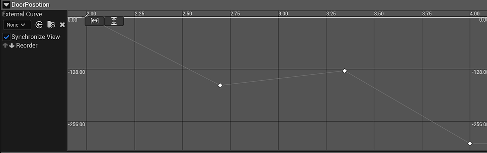
When you are on the timeline blueprint you are giving an animation graph, these graphs help to animate you objects using physics and a timeline to show when an animation starts and ends. I wanted to make the door move slowly and stiffly to make the world feel more old so I first went into the doors animation graph and mapped out both the FPS I wanted and how long the graph animation should be. To create the feeling of a door jamming I added a pivot point in the middles of the timeline to make the door bounce a little before going back down.
This animation graph in 'Unreal Engine' will help improve the doors quality as bu using the graph and placing in your key frames and finding the best way for the flow chart to work you can have smooth and simple animation to your meshes. This will improve this project as it shows I can animate on 'Unreal Engine' and complete the task of making a working door.

By learning animation in a 3D software I can improve and broaden my specialized skills in animation and 2D art. By learning how timeline graphs work and how to create seamless pivot points to make my animation in 3D and 2D flow well I can achieve a better portfolio at the end as I will have a range of artwork showing animation.
Shooting
To make a shooting mechanic I first added collision to the arrows and the shooter by giving them both a 'static mesh'. The arrows have a projectile movement component, which shows are far they go before they disappear. Then I set a collision on the arrows so when it hits the player it alerts the game that they have been hit, which triggers the damage code. When in range using a sphere trace the shooter will say 'true' when the arrow launches giving the player time to move out the way. Once the code has seen that the player has been hit the collision box will push the player back a bit.
This code helps create an obstetrical for the player adding a risk factor in the game. When making a game their has to be a risk factor from small things like burning a pie in a cooking game to saving the world. In my level I have a shooter that will injure the player if not careful. This will help keep the player invested and alert not to fail the game and restart.


By learning to code objects that can harm the player I can make a more interesting game with stakes. This code will help me in the future with other 3D coding when making sure the player does damage when needed ; this helps create a risk factor always keeping the player on alert as they can lose if they are not careful.

Level Layout


A level layout is the basic blueprint of a video game level, showing the structure and arrangement of its core elements and areas. It serves as a communication tool for game developers, detailing how the player will move through the space, what challenges they will face, and how the environment will be structured. This plan includes elements like the overall flow, pathways, obstacles, and the placement of gameplay elements like items and cover.
Main KEY :
Man = Start
Flower = Key
Bush = Decor
Pillow = Bedroom
Bookcase = Library
Target - Shooters
Table = Dinning room

My layout is meant to resemble the silhouette of a gun ; this decision was to present the level as dangerous as you have to find your way through the maze to exit the building but due to the layout it looks like your "circling through the chamber and getting shot out of the gun". I want the player to be in a state of danger with traps ready to spring out at any moment so by having the maps silhouette be a deadly weapon I can make an inference of the idea of the level is that it quickly becomes dangerous when your about to 'leave the gun'.
Progress Photos


Finished Rooms


The Dinning Hall
My main goal of this room was to make it look like a messy and busy dining hall that looks like it was recently lived in. I did this by adding clutter around the tables and walls while also putting in shooters to give the impression that this place is dangerous.
The Bedroom
For the bedroom I wanted to create a cosy yet cramped room showing that the people who lived here were close. Things that show this are the close beds and the shared units holding money and bottles, which can show how much trust they have with each other.
The Hallway
When making the hallways I wanted to create a narrow and busy walkway to make the location feel lived in with main books and coins scattered around the floor.By doing this I can make my level feel more immersive.
The Exit
I wanted to make the exit to the building feel elevated from the rooms, so I made a small staircase up to it, to make the player instantly know that this door is important for the player; also, using golden colours helps with this narrative.
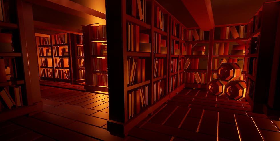
The Library
For the library, I wanted to give off a creepy and dark vide to it, to make the maze portion of the game feel more memorable. Making this section more interesting will help to make sure my level stands out from other maze games.

The Trap
By adding a trap room at the last section of my game, I can add a risk factor to make my game have some elements of skill and danger, making the game interesting and feel more rewarding when you pass that area and get to the exit.

Level Playthrough
This video shows my progress and finished maze/puzzle level in a showcase on how to beat it and what the overall rooms look like. To improve for next time I wish I could find more interesting ways in the level to add hiding places for keys to make he players have to use more strategy to find them.

Analysing Level Design
CSGO : Assault map
Counter-Strike: Global Offensive (CS:GO) is a 2012 multiplayer tactical first-person shooter developed by Valve and Hidden Path Entertainment. It is the fourth game in the Counter-Strike series. Developed for over two years, Global Offensive was released for OS X, PlayStation 3, Windows, and Xbox 360 in August 2012, and for Linux in 2014. In December 2018, Valve transitioned the game to a free-to-play model, focusing on revenue from cosmetic items.The game pits two teams,
Terrorists and Counter-Terrorists, against each other in different objective-based game modes. The most common game modes involve the Terrorists planting a bomb while Counter-Terrorists attempt to stop them, or Counter-Terrorists attempting to rescue hostages that the Terrorists have captured. There are nine official game modes, all of which have distinct characteristics specific to that mode. The game also has matchmaking support that allows players to play on dedicated Valve servers, in addition to community-hosted servers with custom maps and game modes. A battle-royale game-mode, "Danger Zone", was introduced in late 2018.


How they have used 'Choke points'
One way CSGO has implemented choke points is by having area with a mix of a risk and reward play style. This can be seen in one for the spawn pints as there is a staircase that leads to high ground that can be very good for communication with your team as you can see everyone better, snipping enemy player and just having the high ground in general. However, as you take fall damage in this game you are left completely vulnerable as the stairs are the only way up or down, if you jump you will die , if you stay to long you will immediately be cornered and killed. This prevents the player from camping one good area and making the player think is the risk worth it for a certain death on their end. Throughout the map there is also normal choke points you see in FPS ; places in he map were you can be cornered and killed if not careful. One being near the south sector were you can be pushed into an ally and killed quickly.


Is this an advantage to the game?
In a games standpoint this is a good mechanic as it stops players abusing weak points in the level by adding intensive to keep on the move as if they don't they will be killed due to the maps layout. All FPS games have to use choke points as while some player might want to camp without consequence as a game that makes he overall gameplay boring and frustrating as players don't like it when people abuse a games weak point.
In a player standpoint while most players, play the game as intended as a rush in and killed as many as you can, maybe using some strategy to find the best weak points some players like to lay low and not be as involved in the fight. They normal abuse the choke points to have easy kills yet due to CSGO's choke point layout those players might not have as much fun as the game reprimands you if you abuse the spots by staying there to long by having no easy way out of them.
What key landmarks are there?
CS:GO uses landmarks on the Assault map to improve intuitive navigation through unique structures, visual contrast, alignment hints, and consistency in design. Large, distinct structures like the main buildings serve as landmarks visible from afar, while detailed or contrasting areas guide players along paths. Roof detailing and alignment hints help players learn utility throws, and visual indicators are sometimes used to show bombsite locations. For example, the huge water-tank at the back of the map helps make the Map standout in the community as having a landmark helps with making the map recognizable and relevant. In video games, landmarks are unique, visually prominent features used to help players navigate and orient themselves within the game world ; so by having most maps ion CS:GO have at lest one landmark the game has more recognizable maps as just a simple structure can help players remember what they map looks and feels like without thinking to hard.


Is this an advantage to the game?
In a games standpoint this is an important mechanic as it helps with not only the player base remembering certain maps but this can also help with advertising and merchandise. For example, they can add the water tank in a CS:GO revamp game in a trailer to generate excitement and hype for a beloved map and or sell trinkets of the custom CS:GO water tower to dedicated fans of the game that want to support them.
In a player standpoint the large structures that help players navigate intuitively, and uses other design elements like visual cues for utility throws and architectural details to guide players through the map. Landmarks are used to orient players, while details like roof structures and contrasting areas help with grenade throws and general navigation.
What critical paths exist?
Critical path in game design refers to the most direct, mandatory route a player must take to complete the main objectives and finish the game. It is the core progression and is used by designers to plan a game's pacing, flow, and structure, particularly in linear games. Elements on the critical path are considered 'primary' goals, while optional side quests are optional. Due to this game being an FPS the only path way the game has is a circular pathway meaning that the player will eventually return to the spawn point, to make this interesting around the map are buildings , hiding spots, climbing spots and other ways to rush somebody or snipe form afar. Most FPS games follow this formula as they try to refrain from creating linear world since camping and exploiting spots becomes easier as people could hide from the other end of the map, making it a circle stops his from being as prevalent making players feel less angry when people exploit.
Is this an advantage to the game?
In a games standpoint this is an important mechanic it is the main, essential route for a player to roam around the map, and it's a crucial planning and design tool for developers to ensure a coherent player experience and manage project scope. It helps guide the players through the world and make sure they can circle back to the start ; while also helping developers identify key areas, manage resources, and decide which content can be cut or adjusted without breaking the core game flow.
In a player standpoint the players often choose to temporarily ignore the critical path to explore for optional rewards, but in FPS games like this they need to explore the map to find the best spots to snipe, rush and hide. If the map didn't have this players might be frustrated with the gameplay feeling slower and less fast paced and this stops people from hiding at one end of the map making it a chore for people to get them. So CS:GO is a good example of critical path layout in their maps.
What interactive parts are in the level?
Interactive parts within game levels refers to the various game elements, objects, systems, and other mechanics that a player can engage with to progress through the game and experience the worlds environment. These components move beyond simple scenery to provide challenges, rewards, and player agency. CS:GO's main goal and aspect of gameplay revolves around multiplayer tactical engagement, real-time feedback, and strategic communication, rather than extensive environmental manipulation. The core gameplay is objective-based and highly competitive, demanding fast decision-making and coordinated actions. They have made their levels intractable by parkouring into better spots and climbing upstairs to make the aspect of running, hiding ans shooting more fun for the player. If the game didn't have this aspect people would get board quicker and move on faster to other games.
Is this an advantage to the game?
In a games standpoint this is an important because it is the core element that distinguishes them from other media, enabling a player's active role in shaping their experience and narrative. It creates a unique and personal connection to the game, enhances replay-ability, allows for self-expression, and can foster social interaction and even have broader societal impacts.
In a player standpoint the players interactivity is very important for video game players since it provides a sense of control, makes the experience more engaging, and enhances player satisfaction. Player actions have a noticeable impact, whether it's influencing a story, customizing a character, or competing with others, which can lead to increased enjoyment and longer play sessions.

Trampoline FPS
FPS Level ideas
I was asked to create a simple level layout for a FPS game. For this I needed to think of : landmarks, choke points, critical path , flow and affordance. For my main inspiration I used trampoline parks as they seem like a comical idea of a location for a shooter and the map can have fun gimmicks ; such as a bouncy floor and less fall damage. The main colour pallet I could implement are bright and vibrant colours that clash with the harsh black colours of the trampolines to give the map a pleasing visual experience as the player won't constantly be blinded by neon scenery. A trampoline park can have many different places to hide such as : the ball pits and play places, bathrooms, cafe area , kitchen and in any general blind spots. This can be an entertaining map due to the gimmicks of being able to bounce around, the environment being unique and contrasting the genre of the game and the replay-ability as you could find new areas if you explore the map more often,


I have used the web program ' FloorPlan Editor' to be able to create a base line on what I want to create for this task. I used its features of different wall types, accurate measurements and their item selection to be able to note down what places would be what. I then in the art program 'Krita' shaded in and drew out a top down view using the floor plan I have just made to see were and why I have added certain things such as tables, trampolines and exits. I can use the 'FloorPlan Editor' in the future for both 3D and 2D projects to help me layout my levels and maps for a game as it is free, simple yet shows clearly what is what and can be vert beneficial for me and my future projects and or FMP.